Let's Talk Trends

Every year, as the count down to the New Year is coming, the world of interior design eagerly anticipates the unveiling of the latest trends. Magazines, websites, and social media platforms buzz with excitement as experts predict what's in and what's out for the upcoming year. It's all people want to talk about, similar to fashion influencers and magazine dissecting the latest runway collections. But among the flurry of predictions and proclamations, there's an underlying truth that often gets overshadowed: the subjectivity of trends.

Remember when chevron’s were literally EVERYWHERE?!…. (this Missoni pattern is so chic)

…They aren’t a trendy pattern they are timeless when executed correctly (i.e. this Phillip Jeffries Wallpaper)

Trends, by their very nature, are fluid and ever-evolving. What's considered chic and stylish one year may be deemed passé the next. But this is the beauty of interior design: its subjectivity allows for endless creativity and personal expression. A trend, whether it's minimalist Scandinavian design or opulent maximalism, is merely a starting point—a canvas upon which to unleash your imagination.

Also this arabesque patterned tile. It was trendy and everywhere for a while but it’s a classic pattern. Amber Interiors executed it perfectly in this space.

But perhaps the most intriguing aspect of trends is their flexibility. Something can be "trendy" if executed with other trends or in an overwhelming way, yet it can also rise above a fleeting trend to become a timeless classic. Take, for example, the resurgence of mid-century modern design. While its popularity may wax and wane over the years, the fundamental principles of clean lines, organic shapes, and functional beauty remain eternally relevant. Similarly, a bold color palette or avant-garde decor element can exude timeless elegance when integrated seamlessly into a space.

The key to rising above trends lies in the execution. It's not about blindly following the latest fads, but rather about understanding your own tastes and sensibilities. By curating a space that speaks to your individuality and style, you can create a home that stands the test of time.

So, the next time you find yourself caught up in the whirlwind of trend forecasts, remember that true luxury lies not in following trends, but in the art of interpretation. Embrace the subjectivity of trends, and dare to make your mark on the world of interior design. After all, elegance is timeless, no matter the era.

#1 Mistake to Avoid When Designing your Kitchen


Designing a kitchen isn't just about selecting countertops and appliances; it's about creating a space that flows seamlessly and functions efficiently. One of the most critical aspects of kitchen design is considering traffic flow. Picture this: you're rushing to get dinner ready, darting between the stove, the fridge, and the sink. If your kitchen layout isn't thoughtfully planned, you could find yourself constantly bumping into obstacles or feeling like you don’t have enough space.

Take, for example, the placement of the refrigerator. It's tempting to tuck it away in a corner to maximize counter space, but if it's blocking a major walkway, it becomes a hindrance rather than a convenience. Nobody wants to play a game of fridge-door Tetris just to get to the other side of the kitchen. Similarly, positioning the sink and oven directly across from each other might seem symmetrical, but it can create a traffic bottleneck, especially when both appliances are in use simultaneously. Imagine trying to drain pasta while someone is pulling a hot casserole out of the oven—it's a recipe for chaos 😉 .

The most common oversight is failing to consider the space required when appliances are in use. For instance, wall ovens may seem sleek and space-saving when closed, but when open, they can obstruct your walkways. And let's not forget about the humble sink. While it's the workhorse of the kitchen, it can also become a barrier if placed in a high-traffic area. Nobody wants to stop what they are doing so that someone can navigate around you to reach the pantry.

So, what's the solution? When designing your kitchen, prioritize functionality over aesthetics… JUST KIDDING! functionality and aesthetics are equally important and you can create a functional kitchen that also looks amazing. Consider how you move around the space and identify potential chokepoints. Opt for a layout that allows for smooth traffic flow, with clear pathways between key areas like the fridge, sink, and stove. Think about how each appliance will be used and ensure there's ample space for doors and drawers to open without obstructing nearby surfaces. By paying attention to these details, you can create a kitchen that not only looks great but works harmoniously with your daily routines. After all, a well-designed kitchen isn't just a place to cook—it's the heart of the home, where memories are made and shared.

White & Black Checkers...Trendy or Classic?


I recently came across a video about what interior design trends are out in 2024 and the designer said that high contrast checker floors are out in 2024! WHAT?! no way they are a classic!

Black and white checkered floors have a rich history in interior design, dating back to the early 20th century. Originating in European palaces and grand estates, these floors were a symbol of sophistication and timeless elegance. They gained popularity in the United States during the 1950s, adorning the floors of diners and kitchens, adding a touch of retro charm to the space.

A photo I took in Versailles earlier this year

Me earlier this year at Versailles

Fast forward to today, and black and white checkered floors are experiencing a resurgence in popularity. With the revival of mid-century modern and vintage aesthetics, designers are once again embracing this classic pattern. It's not hard to see why – these floors instantly inject a sense of drama and visual interest into any room, whether it's a kitchen, bathroom, or even a foyer.

Gorgeous & Classic

One of the reasons why black and white checkered floors are trending right now is their versatility. They effortlessly complement a variety of design styles, from traditional to contemporary. For instance, in a modern kitchen, they can add a graphic punch and create a sleek, monochromatic look. In a more traditional space, they can evoke a sense of nostalgia and old-world charm. Take, for example, a luxurious bathroom featuring marble countertops, brass fixtures, and a black and white checkered floor – it's the perfect blend of classic and contemporary.

However, while black and white checkered floors may be enjoying a moment in the spotlight, they are undeniably a classic design choice that stands the test of time. Unlike fleeting trends that come and go, this timeless pattern exudes sophistication and elegance that never goes out of style. Whether it's in a historic brownstone or a modern penthouse, black and white checkered floors have a timeless appeal that transcends generations.

In conclusion, whether you're drawn to their retro charm or their timeless elegance, black and white checkered floors are a design statement that is both trendy and classic. So, if you're considering incorporating this iconic pattern into your home, rest assured knowing that you're investing in a look that will never go out of style.

What is cottagecore?

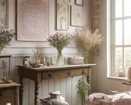
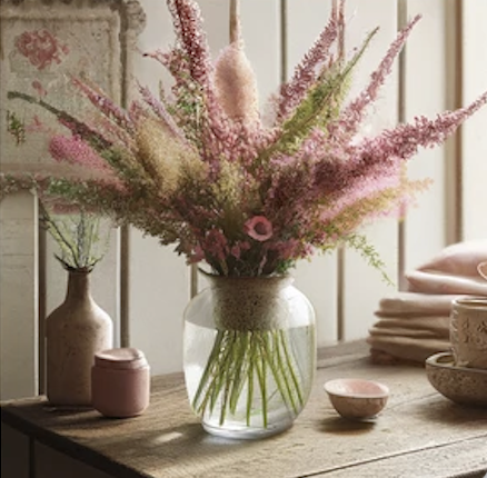
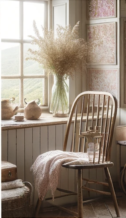
Cottagecore is a movement that idealizes rural life, celebrating simplicity, nature, and traditional activities like baking and gardening. I have noticed that it is gaining popularity on social media although it is claimed to have started in the 2010s combat the fast-paced tech driven lifestyle. I think the pandemic has also driven the appeal of this lifestyle.

Do we think this is a rebrand of Shabby Chic?!

Love Shack Fancy perfectly embodies this style and I love it!

Although this style doesn't necessarily align with my personal taste, I've found myself increasingly drawn to florals, small prints, and plenty of pink since welcoming my daughter.

What do you think? Will this keep trending or do you think it will start to fall out in 2024?

5 Reasons to choose Custom Upholstery

Furniture selection is one of the most exciting parts of the design process. When making furniture selections, one of the most important aspects is to make the decision on whether or not to go with custom upholstery. Here are 5 reasons you should go with custom!

  • Customized look

    • The possibilities are endless (including fabric selection)

    • Subtle details that make the piece unique to you and your home

    • If there is wood, you can coordinate the finish with the rest of the space

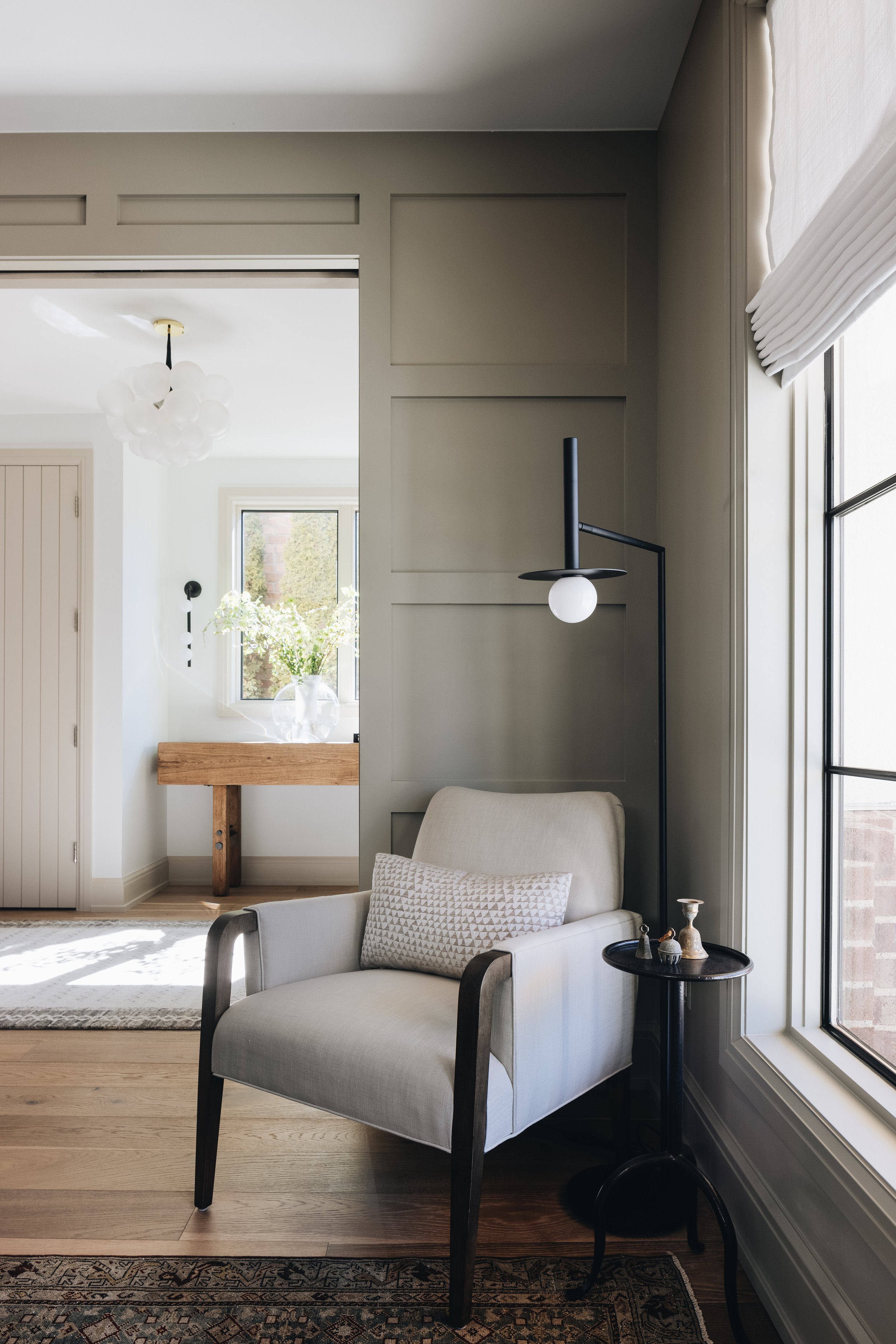
These custom chairs were made specifically for the clients home and needs, plus they add a great color to the space!

This Custom Chair is perfect for the space and will stand the test of time!

  • Longevity and Quality

    • When you go custom, you are purchasing pieces that will live in your home for years to come. 

    • You will find quality that retailers simply cannot provide at their price points.  

    • Handcrafted pieces - Teams of artisans that love creating and take pride in their work

      • Quality materials- Hard wood frames. They also will use processes like eight-way hand tying vs. sinuous wire where the style allows that make the frame sturdier to last a lifetime.

  • Consistency

    • Bench made is a process that ensures consistent quality throughout the entire piece. When we refer to bench made, we mean that the same individual will complete each process of the manufacturing of your pieces. 

      For example, a single woodworker will build out the entire frame. An inside upholsterer will apply fabric and padding before the piece moves onto an outside upholsterer to adhere the fabric to the outside of the frame. 

      When you have more than one of the same piece being made like a set of dining chairs, the same team will complete each process. Upholsterers all have unique techniques and skills. One upholsterer may pull fabric tighter than another.

      By utilizing a bench made process, we can ensure that each piece has a uniform look.

  • Functionality

    • You may need a piece that can stand up in a family with kids, pets and the occasional spilled wine or a shabby chic linen for a more formal space that can occasionally be dry cleaned. Custom upholstery covers all of the bases.

      Comfort is key to creating a piece you will love! If you prefer a firmer sit, you may opt for a spring unit wrapped in foam and fiber that requires less maintenance. If you want a soft and more relaxed look, you may choose to go with a foam core wrapped and down in feathers which will require daily fluffing and flipping/rotating of the cushions. 

      We are here to talk you through your expectations and create a comfortable, customized look that fits your lifestyle.

This custom sofa is made to fit the clients living room perfectly and is also upholstered in a performance fabric to stand up to their teenagers and all the entertaining they do.